How to Write a Landing Page That Actually Converts
You’ve got traffic coming in. People are clicking. But sales? Crickets.
The problem usually isn’t your product. It’s your landing page. A weak landing page bleeds conversions every single day — and most business owners don’t even realize it’s happening.
The good news? Writing a landing page that converts is a learnable skill. Once you understand what drives people to click, trust, and buy, you can apply it every time.
 What Makes a Landing Page Actually Convert?
A high-converting landing page does one thing exceptionally well: it matches what your visitor wants with what you offer — instantly.
According to Nielsen Norman Group, users often leave a webpage within 10–20 seconds. But pages that clearly communicate their value proposition can hold attention much longer. You have a narrow window to make your case. Every word needs to earn its place.
Conversion isn’t about tricks. It’s about clarity, trust, and relevance.
Start With a Headline That Stops the Scroll
Your headline is the first — and sometimes only — thing a visitor reads. It has to hook them immediately.
A great landing page headline communicates a specific benefit, speaks directly to the reader’s pain or desire, and feels impossible to ignore. Vague headlines like “Welcome to Our Website” or “The Best Solution for Your Needs” do none of those things.
Try this formula: [Desired Outcome] + [Timeframe or Differentiator]. For example: “Get Your First 100 Email Subscribers in 30 Days — Without Running Ads.” That’s specific, benefit-driven, and speaks to a real desire.
Write for One Person, Not a Crowd
The biggest mistake copywriters make on landing pages is writing for everyone. When you write for everyone, you connect with no one.
Before you write a single word, get crystal clear on your ideal reader. What keeps them up at night? What have they already tried that didn’t work? What does success look like for them? HubSpot’s guide on buyer personas is a great starting point if you haven’t built yours yet.
When your copy speaks directly to one person’s specific situation, it feels personal — and personal converts. This same principle applies across every format. It’s exactly why most sales emails get deleted within seconds — they read like they were written for a crowd instead of a person.
Lead With Benefits, Not Features
Features describe what your product does. Benefits describe what your customer gets. There’s a world of difference.
“Our platform has a drag-and-drop editor” is a feature. “Build a beautiful website in under an hour — no tech skills needed” is a benefit. One talks about the tool. The other talks about the transformation.
Always ask yourself: So what does this mean for my reader? Keep drilling down until you hit an emotion — relief, excitement, confidence, freedom. That’s where conversions live.
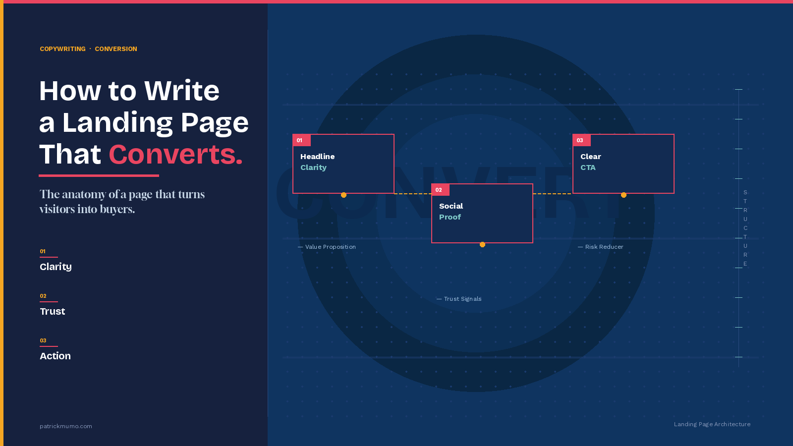
What Should a Landing Page Include?
This is one of the most commonly asked questions — and the answer depends on your goal. But most high-converting landing pages share these essential elements:
A compelling headline that hooks the reader in seconds.
A subheadline that supports and expands on the headline’s promise.
A clear value proposition — why you, why now, why this offer.
Social proof in the form of testimonials, case studies, star ratings, or recognizable logos. According to BrightLocal, 79% of consumers trust online reviews as much as personal recommendations. Don’t underestimate this.
A single, focused call to action (CTA) that tells the reader exactly what to do next.
A risk reducer — a money-back guarantee, free trial, or no-commitment messaging that lowers the barrier to saying yes.
Every element should serve the singular goal of your page. If it doesn’t, cut it.
How Long Should a Landing Page Be?
Here’s the honest answer: as long as it needs to be, and not a word longer.
Short landing pages work well for low-commitment offers — a free download, a webinar sign-up, a newsletter opt-in. When the ask is small and the decision is easy, you don’t need much copy.
Long landing pages are often more effective for higher-ticket offers, complex products, or skeptical audiences. The more money or trust you’re asking for, the more you need to say to earn it. Crazy Egg’s research has shown that long-form pages can dramatically outperform short ones when the offer needs more justification.
The rule is simple: cover every objection your reader has, then stop.
Craft a Call to Action That Compels Action
Your CTA button is where the conversion actually happens. Most people get it wrong by writing something generic like “Submit” or “Click Here.”
Your CTA should reflect the outcome your reader is about to get. Instead of “Sign Up,” try “Start My Free Trial.” Instead of “Download,” try “Get My Free Guide Now.” The more specific and benefit-focused your CTA, the better it performs.
Use first-person language in your CTA copy. Research published by Unbounce found that first-person CTAs consistently outperform second-person alternatives. “Start My Free Trial” beats “Start Your Free Trial” — every time.
Use Social Proof Strategically
People don’t want to be the first to try something. They want evidence that it works for someone like them.
Place testimonials close to your CTA — not buried at the bottom. The best testimonials are specific, results-focused, and come from real people with real names and photos. “This changed my life!” is forgettable. “I grew my email list from 200 to 2,000 in six weeks using this exact method” is convincing.
If you have logos from well-known brands, media outlets, or certifications, show them prominently. Familiarity builds trust faster than any headline can.
Remove Every Reason to Leave
Most landing pages are leaking conversions through distractions. Navigation menus that link out to other pages. Social media icons that invite people to wander off. Paragraphs of text that bury the offer.
A dedicated landing page should have no exit points except two: convert or leave. Remove the navigation bar. Remove sidebars. Remove anything that pulls the reader’s attention away from your single goal.
Formstack’s conversion research confirms that removing navigation alone can increase conversions significantly. Keep the path simple. One offer. One decision. One action.
How Do You Optimize a Landing Page for Conversions?
Writing the page is just the beginning. Great copywriters treat their landing pages as living documents.
Run A/B tests on your headline — it’s the single highest-leverage element on the page. Test one variable at a time: your headline, CTA copy, hero image, or button color. Use tools like Google Optimize or VWO to run clean experiments.
Watch heatmaps with tools like Hotjar to see where people scroll, click, and drop off. The data will show you exactly where your page is losing people — and what to fix.
Conversion optimization is never finished. Every test teaches you something. The best landing pages are the ones that have been iterated on over time.
The Bottom Line
A landing page that converts isn’t built on hype or clever gimmicks. It’s built on a deep understanding of your reader, a crystal-clear offer, and copy that moves people emotionally toward a logical decision.
Get the headline right. Speak to one person. Lead with benefits. Prove your credibility. Make the next step obvious and easy.
Do those things well, and your landing page stops being a leaky funnel — and starts being your most powerful sales tool.
Now go write it.